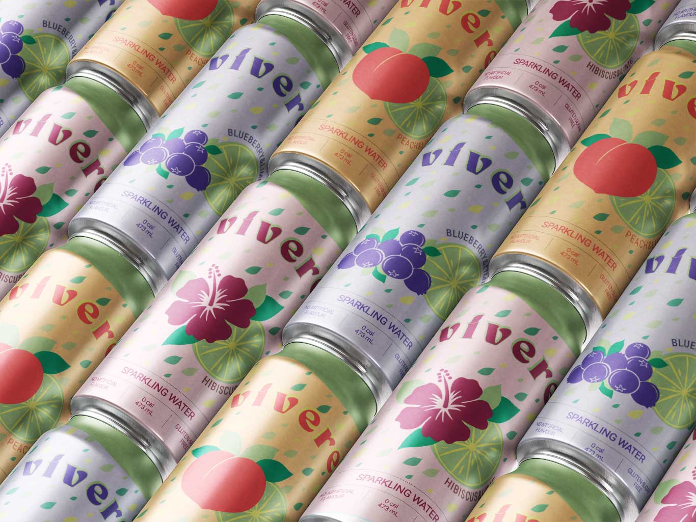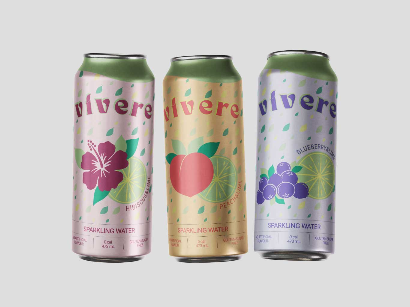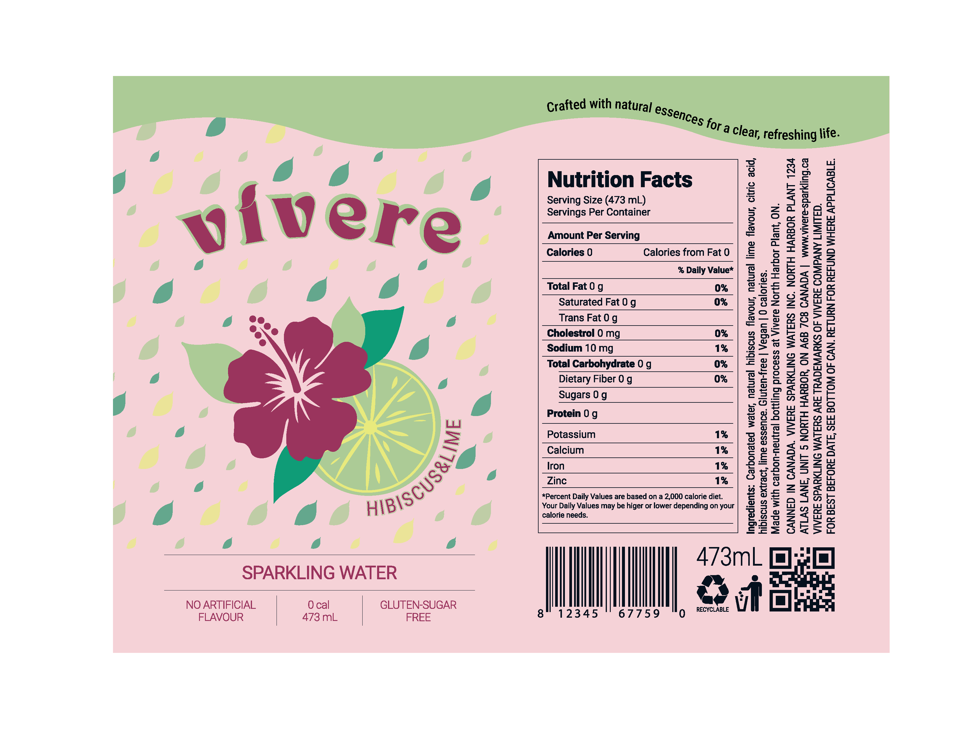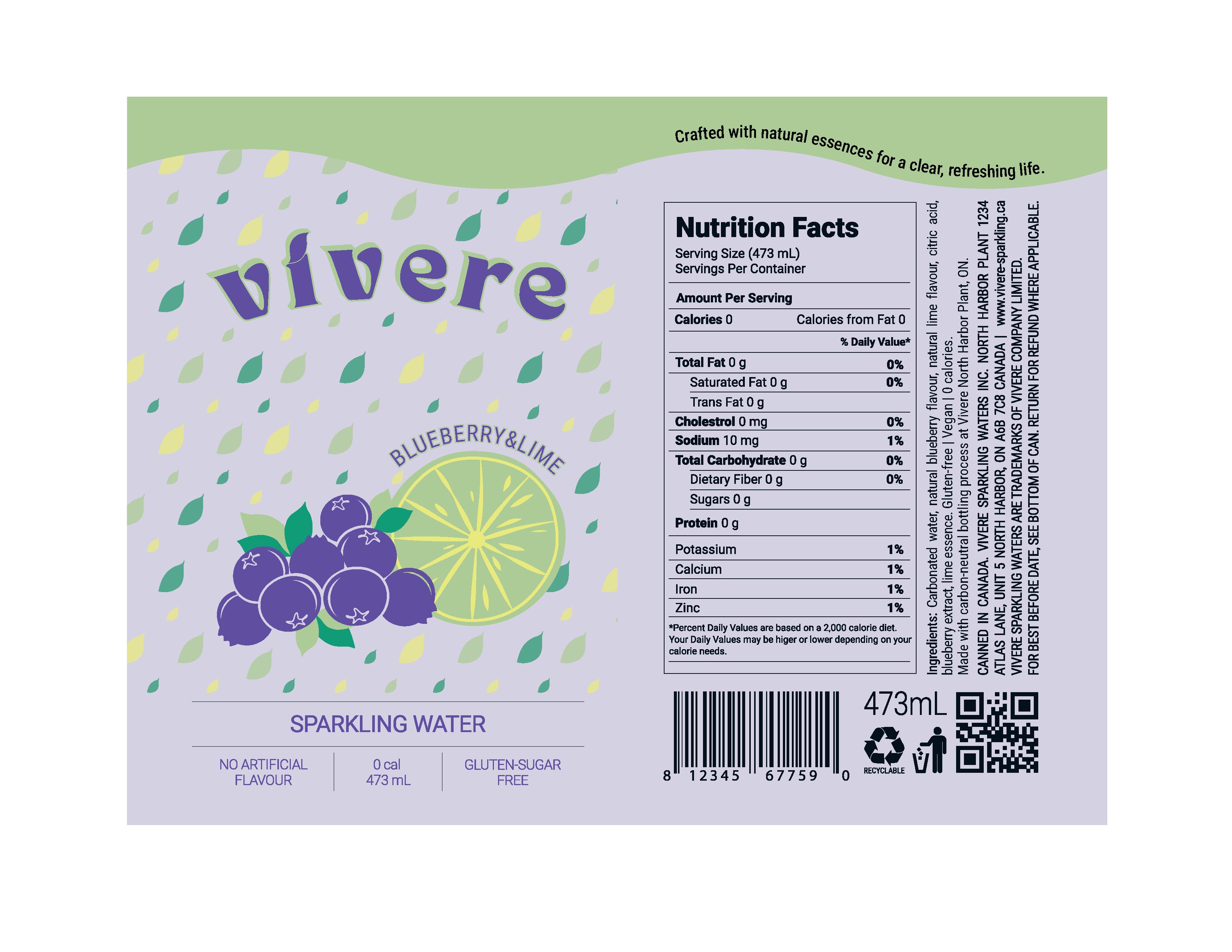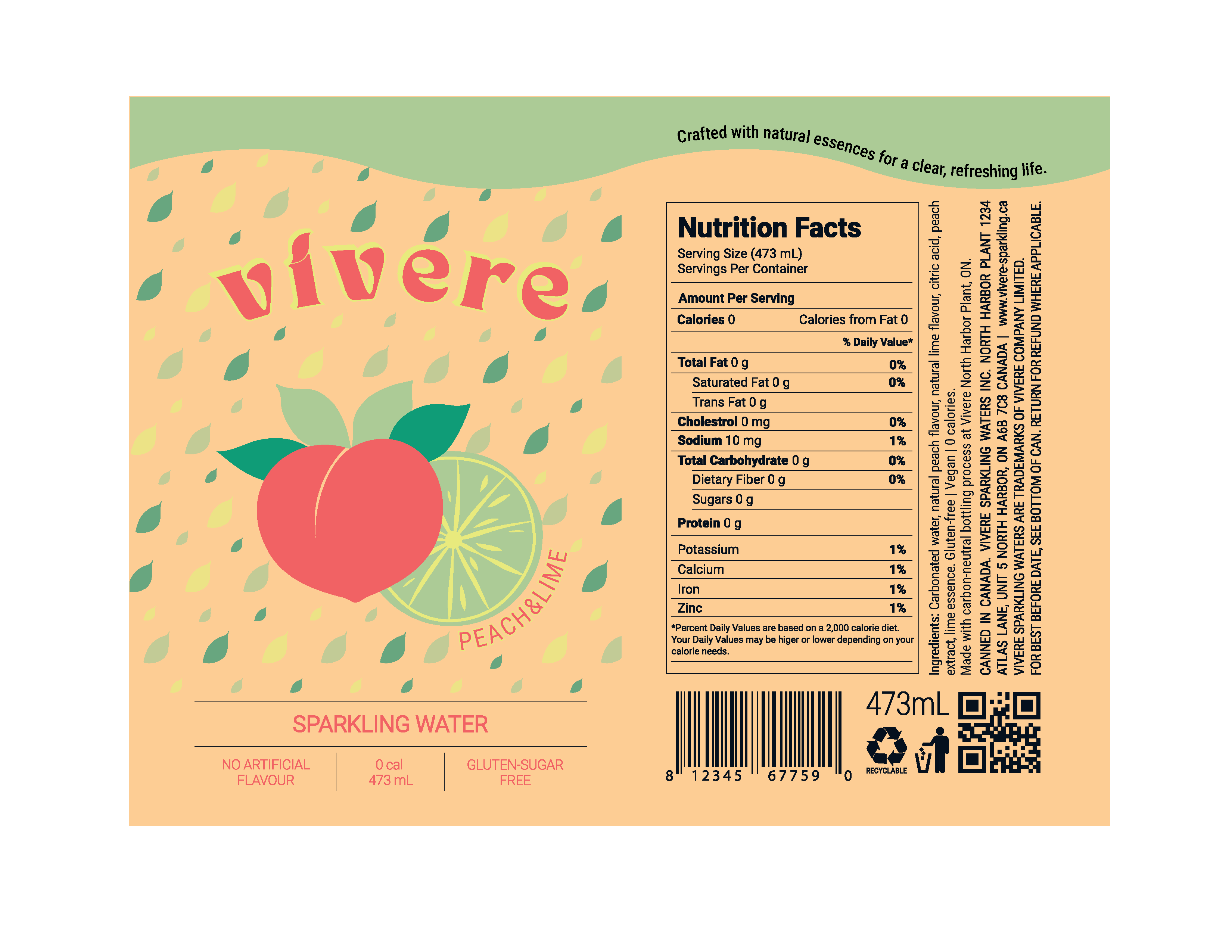
Vivere | Pop Can Design
For this pop can design project, limited to the use of six Pantone colors, I initially developed a hibiscus and lime flavored variant. For the branding name, I chose “Vivere,” meaning to live, aligning the concept with a sense of vitality and everyday freshness. In line with this idea, I selected sparkling water as the beverage type to reinforce the theme of lightness and refreshment. To expand the brand system for portfolio purposes, I also developed additional flavor variations such as blueberry and peach, maintaining consistency with the overall tone and visual identity of the brand.